A card program lets a company issue its own payment cards. Marqeta's APIs make that possible without becoming a bank, and give customers full control over how it works: who gets a card, what it can buy, how money moves.
That control ended at the API. Every screen a cardholder touches was still the customer's to build, and sales had a theory about what that was costing us: deals were being lost to competitors offering something closer to turnkey, because building the front end yourself was a harder sell than the flexibility was worth.
I ran a competitive audit with my team to test it. We mapped who else was building in this territory, what they were building, and who they were building it for. A few of our own lost deals had gone to exactly those competitors, for exactly that reason: a turnkey offering beat our flexibility.

Marqeta
UX Toolkit
UX Toolkit helps Marqeta customers embed payment experiences into existing apps with a single line of code. As design manager, I helped lead it from concept to launch in fall 2024, running the sprint that set the vision and owning the design system foundations that powered it.
Role
Principal Product Designer
2025
Responsibilities
Design
UX Research
Principal Product Designer
2025
Responsibilities
Design
UX Research
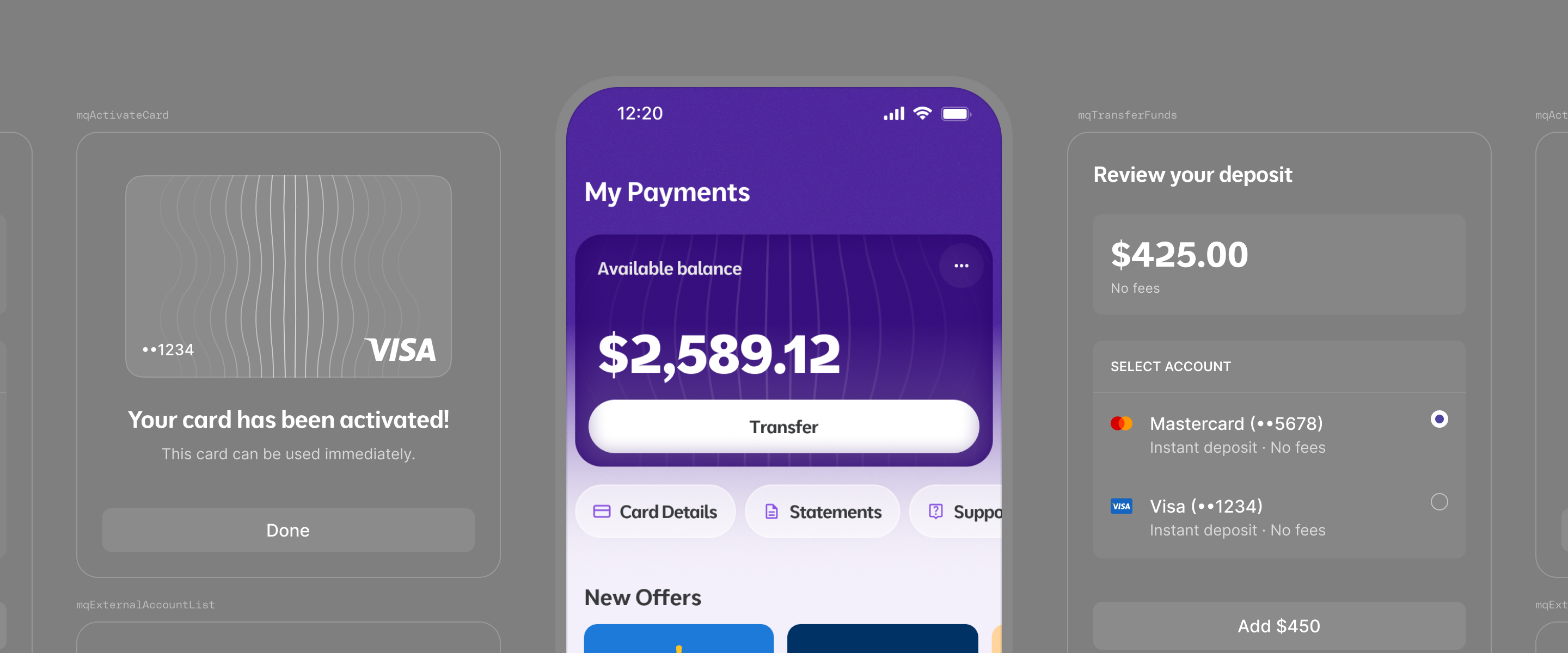
The challenge
WHAT SALES WAS HEARING
Customers wanted to ship, not build. A flexible platform was a selling point until it meant months of front-end work before anyone saw a working product. Some deals were going to competitors offering exactly that shortcut.
WHAT THE AUDIT CONFIRMED
The competitors were few, but established, and we were the new player in this territory. We believed our APIs could let us leapfrog them. We also knew that would take a while to prove.
The design sprint
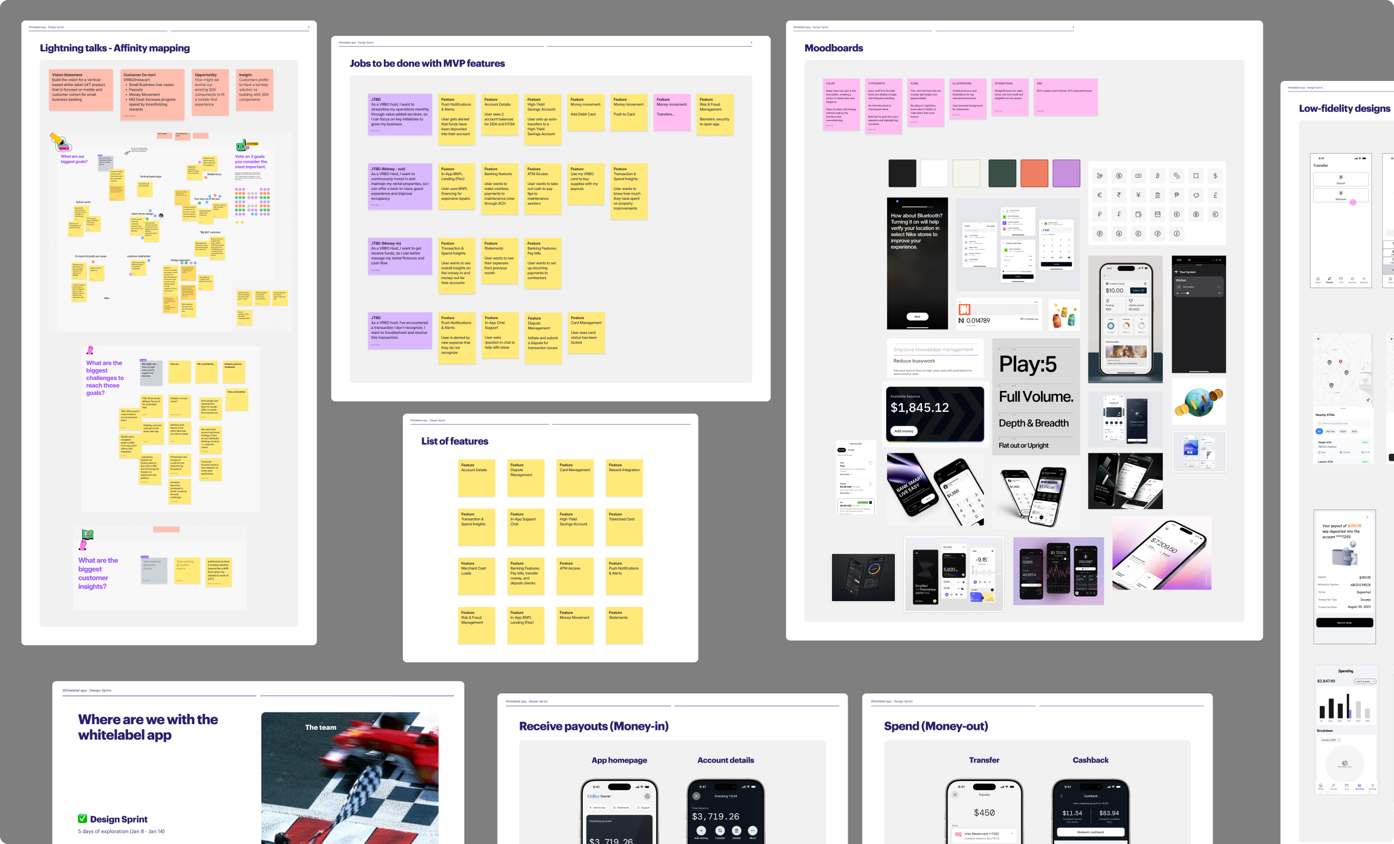
Confirming the problem didn't tell us the answer. I ran a five-day design sprint to organize what we didn't know into questions we could actually answer, and to answer them with prototypes instead of debate. Lightning talks from product, engineering, and design leadership framed the opportunity from every angle. We built jobs to be done around a customer profile we all understood, a small business owner running short-term rentals, and mapped the flows a real cardholder would move through: getting paid out, moving money to savings, financing an emergency repair, disputing a charge they didn't recognize. By day three we had navigation IA, a visual direction, and low-fidelity screens for a complete white-label app.
What the sprint proved
The white-label app was the right destination. Engineering looked at what it would take to build it and saw too much, too soon, more time than we had to build it right.
What we moved forward with
A web SDK, flexible enough to give customers real control, scoped to what we could actually ship well. The white-label app stayed the destination. The SDK became the first step toward it.
The build
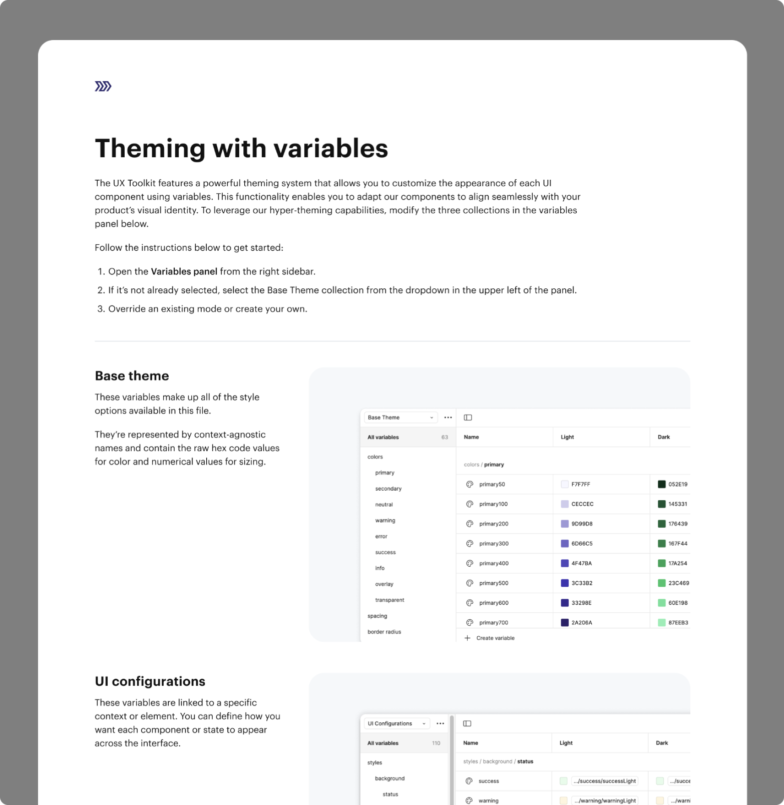
Everything started with the design system. Not because components were urgent, but because the system was the product. Themes cascade to every component, which meant a single change could propagate across every customer's implementation instead of turning into manual work in a hundred codebases. Without that, we'd have been maintaining variations forever.
The design system
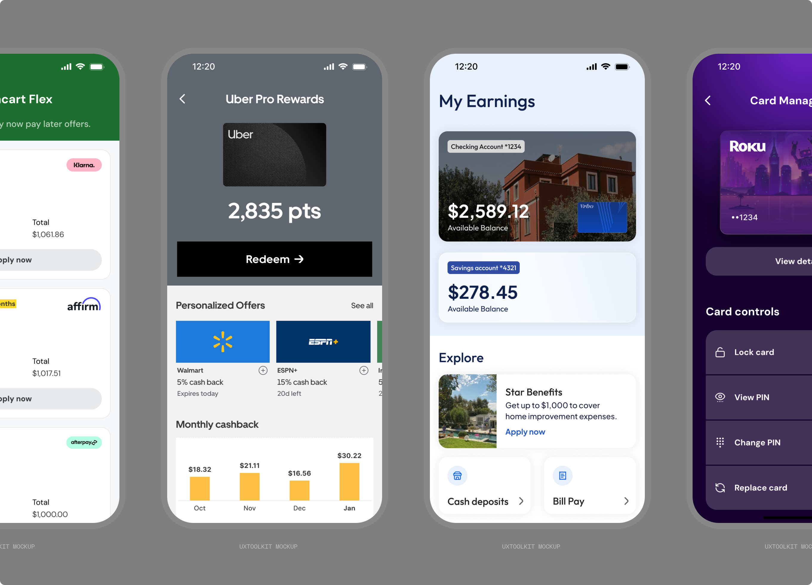
The system had to be legible in both directions. Internally, so teams building different parts of the product spoke one language instead of inventing their own styles. Externally, so a customer's designers and engineers could see exactly what they were getting and what they could change.
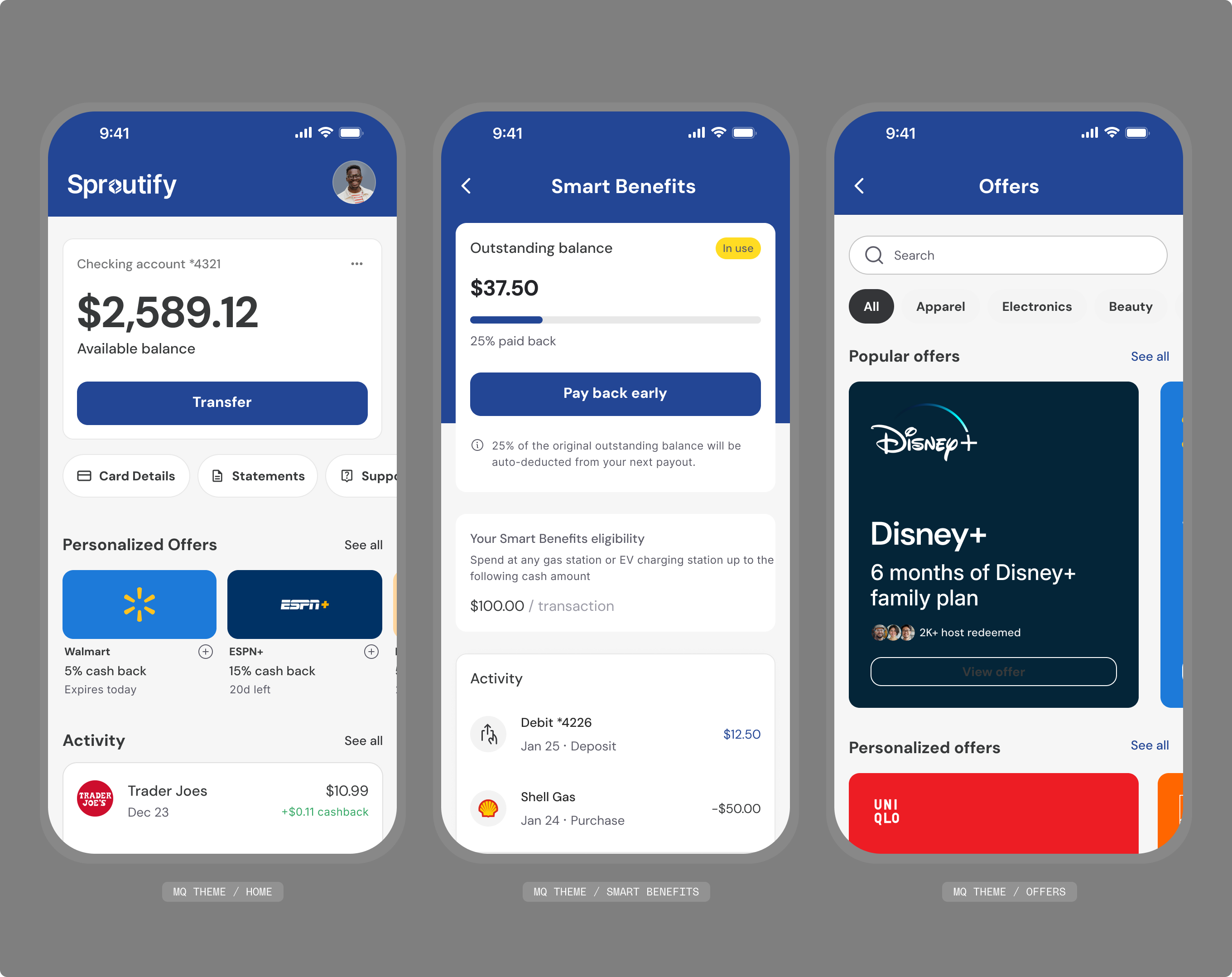
I owned it with one of my ICs, working closely with engineering so what we defined followed their practices and was usable in a codebase. A customer sets their primary and secondary palette, corner radius, and a handful of other properties, and those cascade down. From there their team makes smaller adjustments to land their brand. The theme was the guardrail as much as the feature.
I owned it with one of my ICs, working closely with engineering so what we defined followed their practices and was usable in a codebase. A customer sets their primary and secondary palette, corner radius, and a handful of other properties, and those cascade down. From there their team makes smaller adjustments to land their brand. The theme was the guardrail as much as the feature.
Core flows
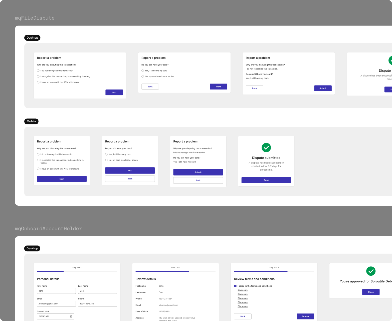
This is where the team excelled. Marqeta understood funding, transactions, disputes, card controls, and security better than almost anyone, from the backend. What nobody had done was own the front end of them on a customer's behalf, deciding what a cardholder sees at every state, including the ones that only exist because of a regulation, and doing it once well enough that hundreds of programs could ship on top of it.
Go to market
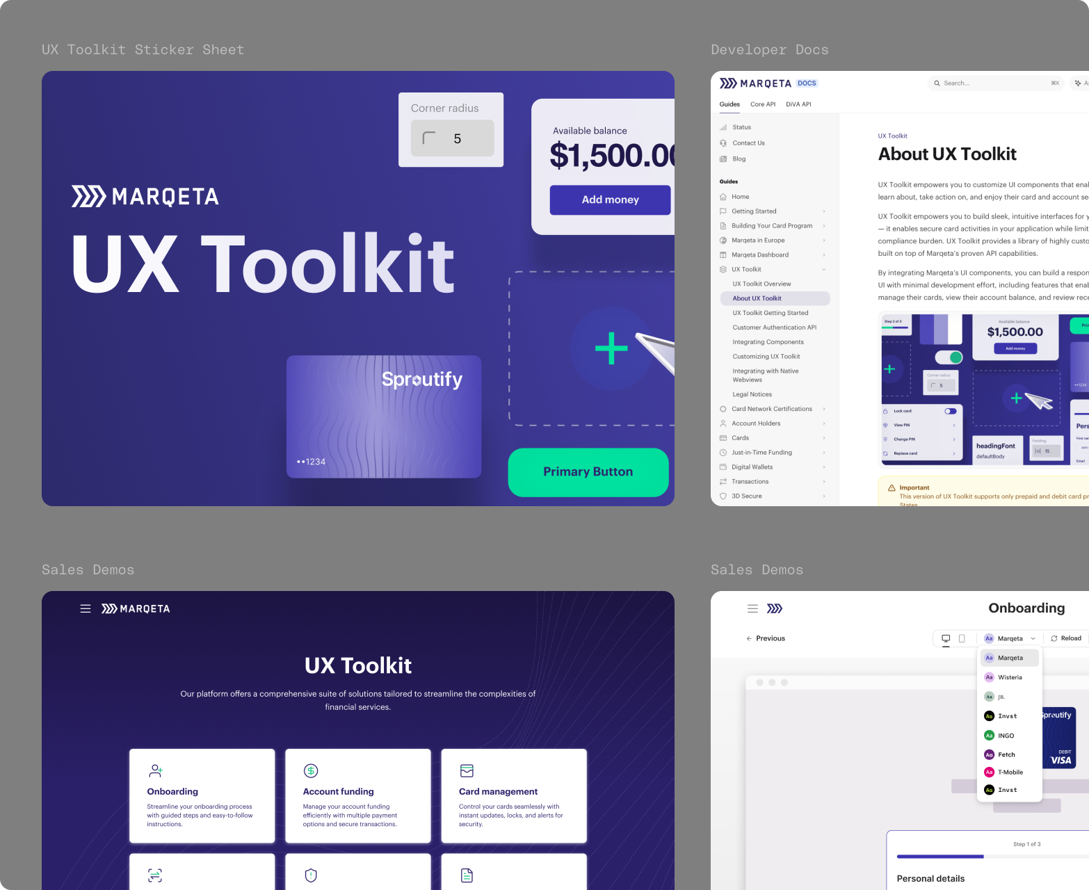
A component library nobody can find isn't a product. Alongside launch we built the surfaces customers would meet it through: Storybook instances they could explore before signing anything, Marqeta Studio for configuring themes, a documentation IA that made the system navigable, and launch guides for implementation teams. I presented to executives through the build and later ran demos with prospective customers, which changed what we prioritized more than once.
What brands needed
Meeting creators where they are
Customers wanted their app to feel like their app. Compliance needed certain elements to stay exactly as approved. Themes resolved most of it, but not all: some features stayed enabled and others locked, decided case by case against what the card networks would accept.
Premium, minus the price tag
Our instinct was to expose everything and let customers decide. Engineering pushed back on how they'd actually consume it, and they were right. We cut the number of variables per component, which made integration faster and kept us from shipping the same too-broad problem customers already had.
Getting brands back in the product
We wanted more than engineering could build in the window. Rather than cutting features evenly, we ranked by value and let effort break ties, the same exercise we'd run inside the sprint. The first release proved the model rather than covering the surface area.
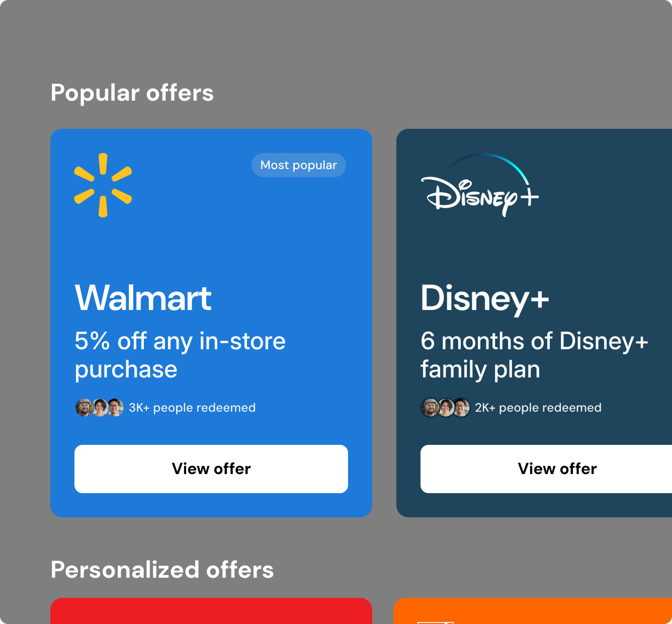
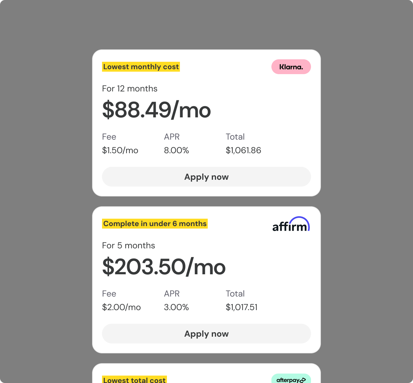
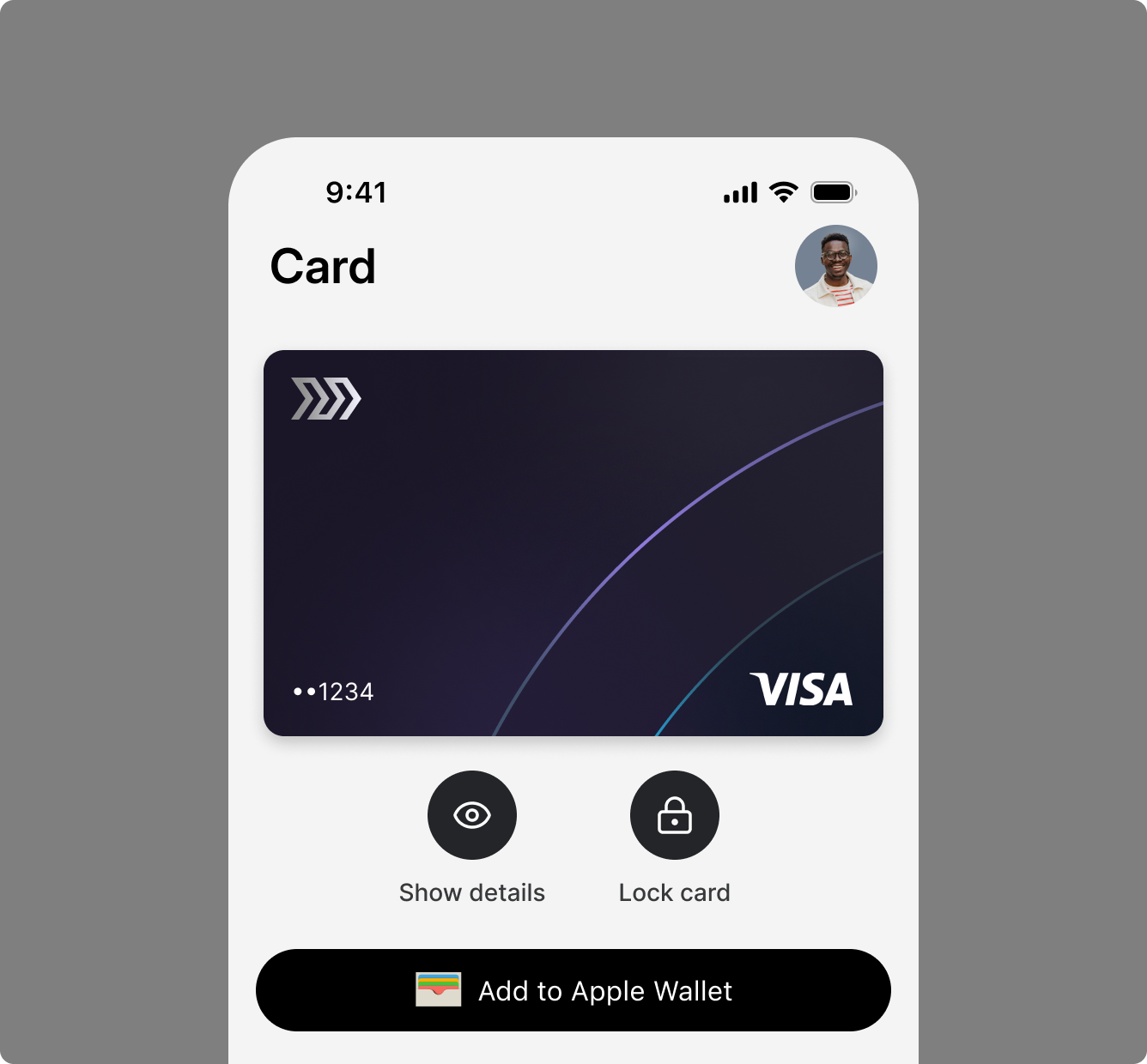
UX Toolkit Examples
Results
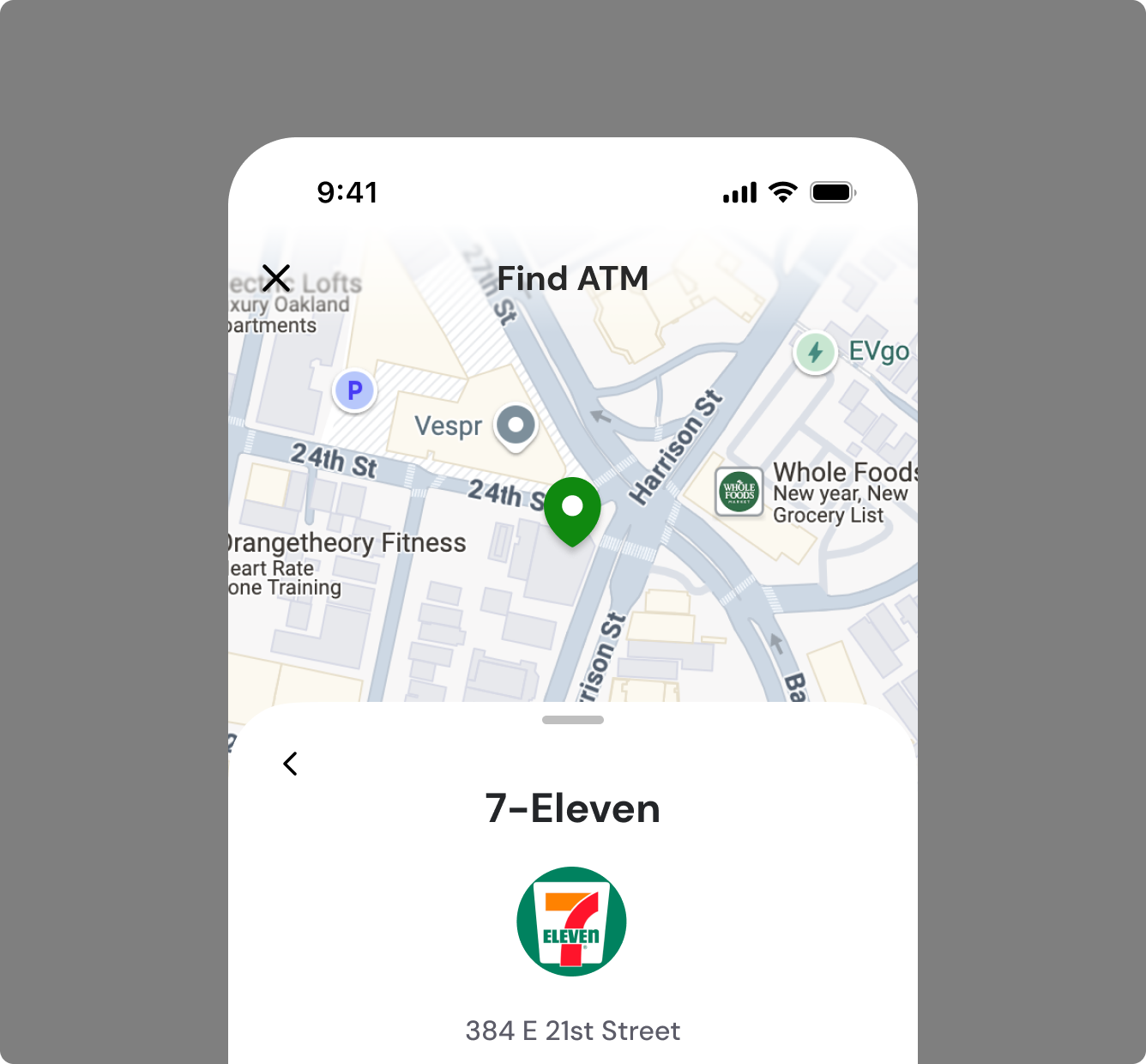
In the end, customers got what the platform had never given them: a working cardholder experience they could brand and ship, with compliance and network approval already handled. Marqeta got its first front-end product, and a company that had only ever sold APIs proved it could design and ship end-user experiences.
UX Toolkit launched in fall 2024 with Bold.org and Finfare on the components at launch. Google and Western Union adopted later. The system held as the customers got bigger, which was the real test.
UX Toolkit launched in fall 2024 with Bold.org and Finfare on the components at launch. Google and Western Union adopted later. The system held as the customers got bigger, which was the real test.
Where it went next
The web SDK was step one by design. The white-label app we sprinted on a year earlier was still the destination, and the foundations we built made it a build rather than a start over: the same design system, the same theming model, the same core flows.
The MVP deliberately proved the model instead of covering the surface area, so what came next was the backlog we'd ranked and deferred. More components, deeper customization, and the banking features that a small business cardholder experience needed but a first release didn't.
The MVP deliberately proved the model instead of covering the surface area, so what came next was the backlog we'd ranked and deferred. More components, deeper customization, and the banking features that a small business cardholder experience needed but a first release didn't.